Kathmandu PM2.5 Plot
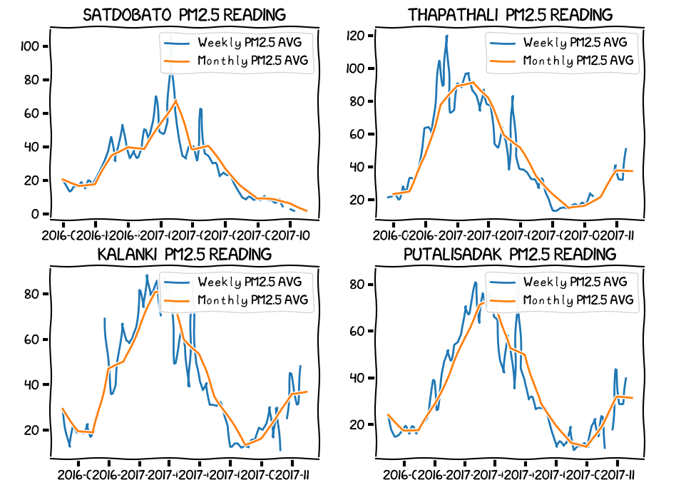
November 16, 2017 •The plt.xkcd() function can convert any matplotlib plot into XKCD style. Trying it with Kathmandu air quality data collected over a year.
Import Library
import matplotlib

plt.xkcd()
font = {'family': 'xkcd','weight' : 'regular','size'   : 12}
matplotlib.rc('font', **font)
Plot Graph
places = ['SATDOBATO', 'THAPATHALI', 'KALANKI', 'PUTALISADAK']
fig = plt.figure(figsize=(10,10))

for idx in range(len(places)):
    ax = fig.add_subplot(2, 2, idx+1)

    tmp = df[df.place == places[idx]]
    tmp.set_index('date', inplace=True)

    tmpweekly = tmp.resample('W').mean()
    ax.plot(tmpweekly.index, tmpweekly.reading, label='Weekly PM2.5 AVG')
    plt.tight_layout()
    plt.legend()


    tmpmonthly = tmp.resample('M').mean()
    ax.plot(tmpmonthly.index, tmpmonthly.reading, label='Monthly PM2.5 AVG')
    plt.legend()
    plt.title(places[idx]+'  PM2.5 READING', size= 16)

plt.show()
Check out matplotlib xkcd gallery for more.